April 13, 2023 class

I saved this placemat from a Paris restaurant because it is an excellent exercise in value. Remember the art adage: Value does all the work, and color gets all the credit. The contrast with lights and darkest darks is what makes our art pop!
This is a complicated drawing, and it will be challenging to get it right - if you are up for the challenge and don’t mind imperfect results, go for it! Otherwise, trace this onto your paper, or we can use the lightbox or transfer paper in class. I will also bring a few already traced to save time for some.
We will use one color to achieve these values.
In preparation for class, please create a grey scale with a few colors. Here’s a short video to help you. Are you able to achieve darkest darks with the color you chose?
If you would like a different option for our in class assignment, I have some still lifes saved on Pinterest that are proper for beginners and intermediate students.
Here are some additional options, in order of complication.
A Trillium - skip the background, or keep it loose

This is one of my favorites…
Ice cubes!

A Box of Chocolates, with a drawing to trace - an introduction to perspective

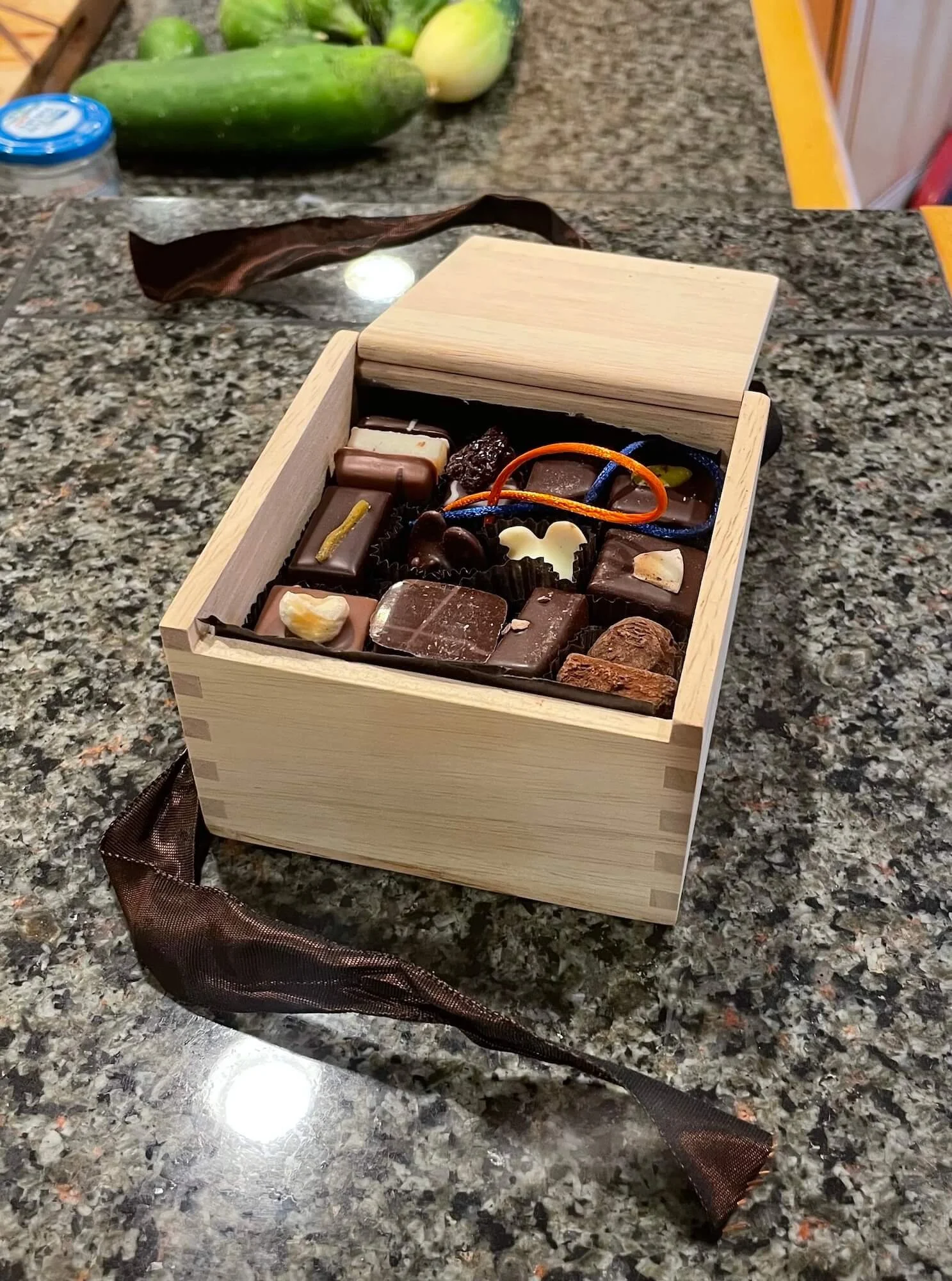
(Ignore the cucumber in the background, haha)
Or, as always, bring anything to class that you’d like to paint!
See you April 13!